
How Can I Make Sure My Sign Is Readable?
Signs are only as successful as their readability. After all, if people can see your sign passing by but not easily read it then was your message really conveyed at all? Think how long people will look at your sign? Are they just glancing at it for a second or two? This is why when we’re designing signs for you, we take into account the readability of the graphics and text for your sign. Readability relies on 5 factors: content, colors and contrast, size, and font type. All play an important role so if one is off it can affect the other 4. Here we breakdown why each matters for your signage.
Fonts:

What fonts should I use for my sign and what fonts should I avoid?
Fonts are one of the biggest components that affect a sign’s readability. Here are suggestions we consider when helping our client with their sign’s font:
Avoid script fonts if possible
We understand that for many they like the look of a flourish or signature, and you may even have script fonts in your logo. However, where possible we suggest for our clients to use fonts without scripts. Even if your logo has a script, we may suggest instead using your logo and likewise use clear, concise channel letters with easy-to-read fonts.
Don’t use narrow fonts, scrunched fonts, or experimental fonts
Narrow fonts may seem optimal when trying to put a lot of letters on a sign; however, the use of narrow fonts often makes your sign harder to read. Similarly experimental fonts may be jarring to the reader and therefore difficult to read.
Cliche fonts to avoid
Though nearly everyone seems to know of comic sans now as a cliche font, we’d also add to the list hot dog and papyrus.
Fonts to use
When designing signage we lean towards fonts that are sans serif or block fonts.
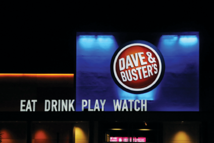
Colors and Contrast

What is the relationship between sign colors and contrast?
Colors and contrast together are 2 essential components of signage readability. Without contrast your sign will not easily be seen as it will blend into the background. Contrast is created in part by using colors that are not too similar. This is why it’s important to keep in mind the color of the wall, or raceway, that the sign will be up against. A red sign against a red brick wall will not stand apart.
Key tips for ensuring your sign contrasts successfully:
Light vs Dark
If your background is a dark color then you’ll want to make sure your sign is made with light colors. The same is true vice versa, because if your sign is dark then you’ll want to make sure it’s up against a light wall.
Outline, reveal, or alternate contrasting return color
If you are required to use certain colors for your branding, consider using an outline on the letters or the sign to help your signage contrast with the background. This way even if the sign itself is similar to the wall, the outline of the letters will ensure your sign is more readable.
If the sign is a dimensional letter, such as a channel letter, then the side of the letter aka a “return” can be made with a contrasting color to help the letters standout.
Size

What size letters should I have to be visible from a far distance?
Size is a key component of readability. A small sign from a distance may be difficult to read. Likewise a sign that’s too large may be easy to read from afar, but if the sign is in a small area where customers walk by at close proximity it may be too large to easily view in one glance. Readability then, along with the costs and permissibility of your signage, must all be taken into account when considering your sign size.
Thanks to the Pennsylvania Transportation Institute, Penn State University and the United States Sign Council (USSC) we have some guidance on minimum required letter height and viewing distance that can offer assistance. (Remember though you must still keep in mind colors, contrast, and content for your sign, as they all work together to help you achieve readability.)
Content:
Of course, one of the key parts of signage is the content of the sign message itself. This is where you must consider how you are branding your business. What information is most important to show to your customers? What is too much and too little? Though this can change for each business, here are a few design tips we suggest when thinking about sign content.
Clean beats clutter
There’s a tendency to want to have your sign say everything: your address, your phone #, business name, what you do, slogan, etc. However when people may only glance at your sign for a second or two what is it you really want them to remember? So for your primary signage stick to the basics of what you need to say.
What you do is as important if not more so than who you are
For primary signage, we suggest emphasizing what you do as much as you emphasize the business name.
Your company may not all be like Coca-Cola, Reese’s, or Disney, where someone can see your business name or even just the brand symbols or colors and already know what your business does and what you are about. So instead use the content to tell them what you can do.
Exp. A business simply named Mike’s or even Mike’s Shop is not as effective as Mike’s Auto Body Shop. If you’re a newer business especially the community may not know who Mike is. However they know if they need car repair services there’s an auto body shop nearby. Over time they may associate Mike with quality car repair work; however, recognition like that is earned and not immediately given to businesses.
Phone #’s and Address are not as essential as they once were
In the age of Google, listing your address and phone # on your business signage is not as essential as it once was. In particular if your business is positioned off of a busy road, passersby may only have a brief time to look at your sign and may therefore not learn and later recall either the address or the phone number. However, they may remember your name and search for it on Google and find your phone # and address.
Brand icons
One way to consider showcasing your brand with your sign as well as with the content is to use icons or iconography that match your business. Katie’s Salon for instance suggests to those visiting what her shop is about; however, Katie could also request the use of scissors, a comb, or other icons in her sign to equate her sign further with her business services. Now clean vs clutter still is important here too, as you don’t want to use too many symbols. However one in addition to the name can help the business stand apart and leave a memorable impression in the mind of visitors.
Conclusion
Though each business will always have their own unique challenges and opportunities with branding and signage, it is important to remember that all 5 factors: color and contrast, size, content, and font play an important role in determining the readability of your sign.
Our designers at Ortwein Sign know what it takes to ensure your sign is readable and eye-catching! We want you to get the best value out of your signage, so call us today at (423) 867-9208 to learn how we help your business thrive with our signage solutions.