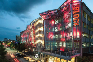
When a client comes to us looking to purchase custom, crafted signage, we make sure that not only is the signage representative of what they want but also what they need for a truly effective sign that will draw in their customers. Oftentimes that may mean we present our clients with ideas they hadn’t thought of, designs that are perhaps a little different but more suited for their location, or perhaps even the location of the sign itself we suggest could be moved to ensure their signage is at its most impactful.
Here’s 5 considerations we take when thinking of how to make the best signage for each client:
1. Size
Sign sizes are often instructed by local code; however, we can help a client use the size they are allowed for their signage to be as eye-catching as possible. You want the sign to be readable from a distance; however, you also do not want the sign so oversized as to not easily be seen by passers-by. If your business is near a highway, perhaps you are aiming more to reach the eyes of the drivers on the road and not the pedestrians at your street level, in which case maybe indeed a larger sign is what is needed. However if you wanted to reach both then perhaps a smaller sign at door level could also assist in reaching this separate audience as well.
Good branding should convey your organization’s personality and values all at the same time. We’ll make sure your message is clear!
2. Sign Angle
Signs are best read when placed straight on, so we make sure that your sign is in such a manner that a viewer could easily look at it directly and read the text. Now a sign may also still stick out at an angle from the sides in particular; however, we do not tilt your sign up or down in the majority of cases as that would limit the speed at which people could read and understand your signage.
3. Sign Positioning
In addition to the angle of the sign we also consider ultimately where the sign will be installed. Now with signage such as ADA interior signs there’s guidelines as to the placement of signs; however, even within local gov’t regulations of outdoor signs we may have some leeway as to the ultimate placement of a sign. Not only do we want to think about whether the sign will be obstructed by elements of the building its on/near, nature such as trees, or man made obstacles, but we also may want to consider how to position the sign in a high traffic part of the business.
Case Study: We were asked to assist a medical complex with the construction and installation of a new LED sign to reach potential future clients. They suggested one location, but after surveying the site we suggested moving the sign by about 10-20 feet so as to position this monument sign where a coffee drive-thru line would have immediate eye line of the sign. We were able to also still maintain eyeline for the many commuters who drive by the sign everyday on the main road, therefore achieving the initial goal and reaching an entirely new, more captive, audience just by moving the sign a few feet.
4. Illuminated Signage
If your business is only open between 10am-5pm, daylight hours in most states, you may think it’s fine that your business sign isn’t lit up. However you’re potentially doing yourself a disservice if you do not also consider how many future clients you could be reaching after hours by simply illuminating your sign. If we see your business is in shadow much of the day too, then we may suggest a well-lit sign too to stand out even in the day time. There is a lot of variability in lighting, from LEDs to neon and more, and we take all of that into account with each of our client’s signs.
Perhaps the most clever example lately taking into account the importance of light and branding is this Billboard advertisement by the BBC in England:
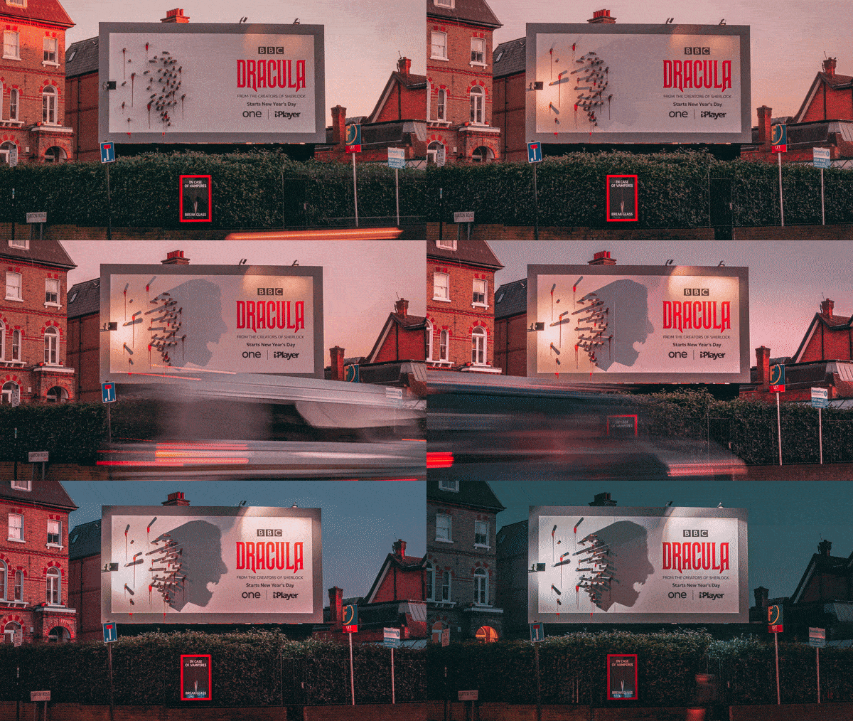
(Source: AdWeek via BBC Creative)
5. Contrast
ADA signs in particular are made with standard regulated levels of contrast so as to be most readable. Most signs do not have such requirements; however, we still consider this when helping clients in the sign design process. If a sign’s lettering were to blend in too much to the background for instance then few would successfully read your sign. Oftentimes a person passing by may only have a few seconds to see your sign, and you do not want them to spend that time either guessing or ignoring what message you’re trying to convey.
These are the 5 key factors that are top of mind when we initially consider your sign needs, as of course with every client we want to make sure you get the most effective signage possible to reach your customers. After all we know your business is trying to stand apart, so we think it’s important to make sure your sign does too.
If you want an expert partner to help with your next sign project, please submit a quick quote request form or call us at 1-866-867-9208 and we’ll be happy to get in touch with you.


